What is Mobile-Friendly Design – Why it’s Essential and How it Impacts Visitors
Apr 9, 2025
Website Strategy

1. Introduction
In today's mobile-first world, a website that performs seamlessly across all devices is essential rather than a luxury. Mobile-friendly design refers to the practice of creating and optimising websites to function efficiently on smaller screens such as smartphones and tablets. This design approach ensures that content is easily accessible, readable, and navigable, regardless of the device being used.
With mobile devices now accounting for a substantial portion of web traffic (Dotwall; Design Hive), businesses must adapt to meet the demands of their increasingly mobile audience. This shift not only enhances user experience but also positively influences search engine performance, as search giants like Google give preference to mobile-optimised sites through initiatives like Mobile-First Indexing (BrowserStack; 99Designs).
In this blog, we will delve into the key aspects of mobile-friendly design:
What it is: A detailed look at the concept and its various approaches including responsive, mobile-first, and mobile-optimised designs.
Why it matters: An exploration of how mobile-friendly design bolsters user engagement, search engine rankings, and overall credibility.
How it impacts users: Insight into the benefits for visitors, from reduced bounce rates to improved accessibility.
How to achieve it: Practical steps and best practices for making any website truly mobile-ready.
2. What is Mobile-Friendly Design?
Mobile-friendly design is the methodology behind creating websites that offer optimal user experiences on mobile devices such as smartphones and tablets. Essentially, it involves adapting a site’s layout, content, and functionalities to ensure they remain accessible and user-friendly across smaller screens and varying device capabilities.
There are several approaches to achieving a mobile-friendly design:
Responsive Design: This method uses flexible grids, fluid images, and CSS media queries to adjust the site layout dynamically to fit different screen sizes. Responsive design focuses on creating one site that can cater seamlessly to all devices, ensuring consistency in user experience (BrowserStack; 99Designs).
Mobile-First Design: This approach prioritises designing for mobile devices before scaling up for larger screens. By focusing on the mobile user experience from the outset, designers ensure that essential content and functionalities are not lost as the screen size increases (BrowserStack).
Mobile-Optimised Design: Unlike responsive and mobile-first design, mobile-optimised design involves creating a distinct version of the site tailored exclusively for mobile users. It simplifies navigation, streamlines content, and compresses elements to improve load speeds and overall interactivity on smaller screens (99Designs).
3. Why is Mobile-Friendly Design Essential?
In an era where a significant portion of web traffic comes from mobile devices, mobile-friendly design is critical for several reasons:
Increased Mobile Usage: With mobile devices accounting for over half of global internet traffic, neglecting mobile optimisation can mean missing out on a vast and growing audience. A mobile-friendly website ensures effective engagement with this expanding user base (Dotwall; Design Hive).
Enhanced User Experience: A site that adapts seamlessly to mobile devices delivers intuitive navigation, legible text, and faster load times. This leads to lower bounce rates and increased time spent on the site key factors in building customer satisfaction and loyalty (Design Hive; Mailchimp).
Improved Search Engine Rankings: Search engines such as Google prioritise mobile-optimised sites through their Mobile-First Indexing policies. A mobile-friendly site is more likely to achieve higher rankings in search results, thereby enhancing its organic reach (BrowserStack; 99Designs).
Business Credibility and Trust: A professionally designed mobile interface conveys reliability and attentiveness to user needs. Visitors are more likely to trust and engage with a brand that demonstrates a commitment to providing an optimal mobile experience (Design Hive; Mailchimp).
4. How Mobile-Friendly Design Impacts Visitors
Mobile-friendly design greatly enhances the user experience and drives better engagement across devices. The key impacts include:
Reduced Bounce Rates: A website that adapts well to various devices keeps visitors engaged, leading to lower bounce rates. Users are less likely to leave when content is readable and navigation is intuitive.
Higher Engagement: A clean and efficient interface encourages visitors to explore more pages and interact with content. This increased engagement often translates into better user retention.
Improved Conversion Rates: With thumb-friendly forms and streamlined navigation, visitors find it easier to complete actions such as sign-ups or purchases. A focus on a smooth user journey directly impacts conversion rates in a positive way.
Enhanced Accessibility: Features such as touch-friendly buttons and clear typography cater to a diverse audience, including those with accessibility needs, ensuring that the website is inclusive for all users.
5. Steps to Make a Website Mobile-Friendly
To ensure your website performs excellently on mobile devices, consider implementing the following practical steps:
Implement Responsive Design: Use CSS media queries, fluid grids, and flexible images to create layouts that adjust dynamically across device sizes (BrowserStack; Mailchimp).
Optimise Media Assets: Compress images and videos to reduce load times without compromising on quality. This step is vital for maintaining performance and user satisfaction.
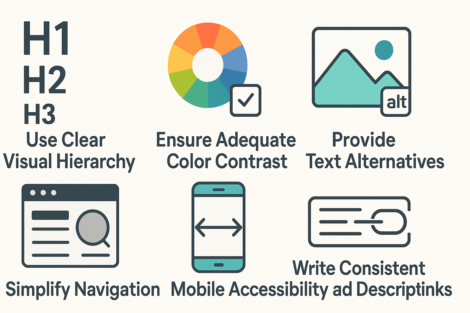
Simplify Navigation: Replace complex menus with collapsible menus or hamburger icons to create a clean and user-friendly interface on smaller screens (99Designs).
Focus on Touch-Friendly Elements: Ensure that interactive elements, such as buttons and links, are large enough for easy tapping, with ample spacing between them. This is especially critical in mobile design to prevent mis-taps (BrowserStack).
Test and Optimise Performance: Regularly use testing tools like Google PageSpeed Insights to monitor your website's performance. Testing helps identify areas for improvement and ensures your site remains efficient across all devices (Mailchimp).
6. Conclusion
In today’s rapidly evolving digital landscape, mobile-friendly design is no longer optional it’s a fundamental pillar for creating engaging, accessible, and high-performing websites. As we’ve explored, crafting a seamless experience on mobile devices not only enhances user engagement and conversion rates but also establishes solid credibility and boosts search engine rankings. The shift to a mobile-first mentality opens new opportunities for innovation and improved user interactions, making it a must-consider aspect for anyone serious about delivering an exceptional online experience.