Common UX Mistakes to Avoid: A Comprehensive Guide
Apr 16, 2025
Website Strategy

Introduction
In today’s competitive digital landscape, great user experience (UX) isn’t just a nice-to-have, it's a key differentiator that can make or break your product. When done well, UX design leads to higher engagement, increased customer satisfaction, and improved conversions. But when it goes wrong? Users bounce, products get abandoned, and reputations suffer.
If you're just getting to grips with UX, start with our Intro to User Experience (UX), which lays the groundwork for what good UX looks like especially for small businesses. We’ve also talked about the importance of first impressions in Why Website First Impressions Matter and Common Website Mistakes That Drive Visitors Away, which show how small UX missteps can have a big impact.
Unfortunately, even experienced designers can fall into common UX traps that compromise usability and clarity. From overcomplicating navigation and neglecting mobile users, to skipping user research or overlooking accessibility, these mistakes add up to a frustrating user journey. Want to know how fast your site needs to be? Check out Speed and Performance Matters to learn why load time is often the first impression.
In this guide, we’ll explore the most common UX design pitfalls and provide practical solutions, backed by real-world examples and research. Whether you're designing a new product or refining an existing one, avoiding these mistakes will help you build more intuitive, inclusive, and effective experiences.
Here’s a preview of what we’ll cover:
Navigation and Interface Complexity: Why simplicity trumps feature-bloat (3mil, UXtweak)
Mobile and Responsive Design: Why responsive design is no longer optional – see our own tips on Mobile-Friendly Design (Maven, Userpilot)
User Research and Empathy: Designing with data not assumptions (UXDesign.cc, CareerFoundry)
Communication and Feedback: Writing error messages that actually help users (Interaction Design Foundation)
Accessibility and Inclusivity: Making sure your product works for everyone (NNGroup, WCAG Guidelines)
Performance and Optimisation: Speed, clarity, and prioritising what matters most – covered in Speed and Performance Matters
Testing and Iteration: The critical role of usability testing and continuous improvement (NNGroup)
1. Navigation and Interface Complexity
Overcomplicating Navigation
A common UX mistake is overloading your navigation menu with too many choices or confusing labels. This leaves users feeling overwhelmed and unsure of where to click next.
The fix? Keep things simple. Use clear, intuitive labels that reflect the user’s goals, not your internal structure. Your site’s navigation should guide users effortlessly, not leave them guessing.
👉 Not sure how your current navigation is performing? Consider a quick SWOT analysis of your website’s structure to identify weak spots. For external insights, UXtweak offers excellent examples of navigation best practices.
Cluttered Interface Design
A cluttered interface filled with too many buttons, pop-ups, colours, or competing messages can instantly turn users off. It distracts from your core offering and makes it harder for people to take action.
The solution? Focus on what matters most. Use white space to create breathing room and follow minimalist design principles that allow your message to shine. We explored this further in Why Simple Design Works, a guide to creating clean, focused experiences. You might also find 3M’s research on visual attention useful showing how layout impacts user engagement.
Poor Information Hierarchy
When everything is loud, nothing is. Without a clear structure, users struggle to scan and find what they need.
Fix it by establishing a strong visual hierarchy using headings, spacing, and consistent colour schemes to signal what's most important. Start with a Landing Page designed with hierarchy in mind, and then build out your content from there. For an external reference, NNGroup outlines how visual hierarchy influences usability.
2. Mobile and Responsive Design Issues
Neglecting Mobile Users
With over half of all web traffic now coming from mobile devices (Statista), failing to prioritise mobile UX is a major red flag. Users on the go expect fast, clean, mobile-first design and if they don’t get it, they bounce.
The fix? Build your site with mobile users in mind from day one. This isn’t just about resizing content, it's about making it easy to interact with your brand on a small screen. See our Mobile-Friendly Design post for practical tips. Also, this Userpilot guide on mobile UX gives insight into critical design mistakes on mobile.
Lack of Responsive Design
A responsive site adapts to screen size whether it's a phone, tablet, or desktop. Without it, your layout breaks, images overflow, and user experience crumbles.
Solution? Make responsive design a core design principle, not an afterthought. Test your layouts across multiple devices and browsers throughout the design process. Maven’s breakdown is a great primer on why responsive design is no longer optional in 2025.
3. Research and User-Centered Design
Designing for Yourself, Not the User
One of the most damaging assumptions is thinking you are the user. What makes sense to you may not reflect how your customers think, feel, or behave.
What to do instead? Conduct user research to understand your audience. Create personas and test early. This user-focused approach is explored in our Intro to UX. For a broader industry perspective, UXDesign.cc often publishes thought-provoking case studies on designing with empathy.
Failing to Conduct Adequate User Research
Without real data, you're designing in the dark. Many small businesses skip research due to time or budget constraints, but the cost of getting it wrong is often higher.
Solution? Use simple tools like surveys, interviews, or even short feedback loops to gather real input. CareerFoundry’s UX research guide is a helpful place to start, even if you’re new to research.
Taking Assumptions as Fact
It’s natural to rely on internal opinions or gut instinct. But assumptions can be dangerous if they go unchecked.
The answer? Adopt a culture of testing. Validate decisions with data whether it’s through A/B testing, usability sessions, or heat maps. The Interaction Design Foundation has excellent articles on research methodology and how to avoid common testing pitfalls.
4. Communication and Feedback
Unhelpful Error Messages
Error messages are often an afterthought, but a vague “Something went wrong” doesn’t help anyone.
Why it’s a problem: Users feel lost and frustrated when they don’t understand what went wrong or what to do next.
Solution: Write clear, actionable error messages. Let users know what happened, why, and how they can fix it. These small touches go a long way in building trust. For guidance, check out the Interaction Design Foundation’s tips on designing helpful error feedback.
Lack of Feedback and Guidance
When users click a button or submit a form and nothing seems to happen, it’s confusing.
Fix it by providing instant feedback loading animations, confirmation messages, and visual cues that signal progress. This reduces user anxiety and boosts confidence. We explore more interaction cues in Benefits of Clear CTAs, which shows how timely feedback improves engagement.
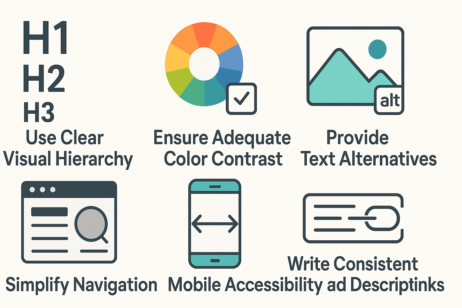
5. Accessibility and Inclusivity
Ignoring Accessibility Standards
Not designing for accessibility means alienating users with disabilities and it’s more common than you might think.
The issue: Many websites lack proper alt text, keyboard navigation, or sufficient contrast. This excludes people and often violates regulations like WCAG.
Solution: Bake accessibility into your design process from the start. Use tools like WAVE or Axe to audit your site and follow best practices. The NNGroup’s accessibility principles provide a clear starting point.
We touched on the importance of first impressions in Why First Impressions Matter and accessibility plays a major role in how people perceive your brand.
Designing for a Narrow User Base
Assuming all users share your context (location, age, ability, or tech setup) is risky.
What to do instead? Broaden your perspective by testing with diverse users and using inclusive language and visuals. Keep in mind that inclusive design = better design for everyone. Revisit your visual design choices to ensure they support readability and clarity for all.
6. Performance and Optimisation
Slow Load Times
Even the most beautiful website will fail if it loads slowly especially on mobile. In fact, a delay of just 1 second in load time can reduce conversions by 7% (Neil Patel).
Solution: Compress images, streamline code, use lazy loading, and optimise hosting. Tools like Google PageSpeed Insights or Lighthouse can help you identify bottlenecks. We’ve covered the user impact of site speed in Speed and Performance Matter.
Un-prioritised Content
Trying to say everything at once? You’ll likely say nothing clearly.
Fix it by identifying the most important actions for users to take and structuring your content accordingly. Use heat maps or scroll tracking to see how users interact with your pages. Learn more about content hierarchy in Landing Page Essentials and First Impressions.
7. Testing and Iteration
Skipping Usability Testing
Many small businesses assume testing is “nice to have,” but it’s one of the most cost-effective ways to improve UX.
The issue: Without usability testing, you don’t know how real users experience your site you’re just guessing.
Solution: Even simple user testing with 3–5 participants can reveal critical issues. Tools like Maze, UsabilityHub, or moderated sessions can help. CareerFoundry explains the basics of getting started.
Failing to Iterate
UX isn’t one-and-done. Your users’ needs evolve, and so should your design.
Fix it by committing to continuous improvement. Monitor site analytics, review behaviour flows, and schedule regular design reviews. For example, start each year with a Website Redesign to identify what’s working and what needs refreshing.
Conclusion: Small Fixes, Big Impact
Great user experience doesn’t have to mean a complete overhaul. Often, it’s the small, thoughtful changes streamlining a menu, adding a helpful error message, or optimising for mobile that create the biggest impact. By avoiding these common UX pitfalls, you’re not just improving your website; you’re building trust, removing friction, and making it easier for your visitors to become loyal customers.
As we’ve explored in previous posts, from first impressions to mobile design, every part of your site contributes to how your brand is perceived. A well-designed experience shows your users that you understand their needs and that you care enough to meet them.
If you’re not sure where to start, begin by observing how people use your site today. What frustrates them? Where do they hesitate? Then apply what you’ve learned here to test, refine, and improve.